If I have the choice of how to sink or swim, I’d rather fail by my own means than succeed with someone elses advice. I had created a oddball character called spannerman.
https://spannermanrevisited.wordpress.com
There he is asleep in his shed. He has a very abnormal view of the way the world works to say the least.
I then had the idea that I showed at the beginning of this blog of layering images together. This one of is the Guildhall in Northampton. These can be decorative and interesting to look at, attracting the the eye with angles and shapes.
I had ideas of making a series of doll images.
and trying to be humorous…
I couldn’t seem to get what I was after with these images They weren’t strange enough. Spannerman is me without the filter, and is probably a lifetime project! Can’t relate to these two in the same way. I could make set of images called “how to murder your lover”. I knew what my fellow students were planning on showing, I wanted to do something no one else was doing and I liked these abstract images I was making. I also didn’t want to make images that had, “a message” or expressed “an opinion”. It is all just vanity after all, and no ones view is particularly better than anyone elses. So I decided to go with the decorative images for the exhibition, quite a few people had said they like them. This is the set up, three boards each with a different theme but using similar techniques to make the images. Click on the main image, then click again to get the big view to see more clearly. The three panels are each themed. Outdoors, Indoors, and Work. I know all of these places very well. I have visited the Town Hall Square Fountain since I was a child. Indoors is my partners flat in Northampton. Work is the toolroom where I work. I’ve tried to evoke in each image, a sense of what it’s like to be in that place. I think I need to do more work on the printing of these images. Some do look a bit flat. With Northampton one above you can see that the choice of location for the series of shots is very important. I thought as I chose where to stand as I began shooting that this location might give me a good final image and it did.
I’ll start with the one of the fountain, eight images taken at 45 degree increments around the fountain. The focus point was the top of the railing. All these images except the large factory one was taken with an 18-35 lens at 18mm. People do like this one. I think the sky is a bit too bright. I think I’d have to go back to the photoshop psd of this and edit each layer individually to try and retain some of the colour in the sky. The flags could be defined better too. The other two on this board look a little dark.
The middle board contains images of my partners flat, these have printed the best, My partner loves looking at these closely and finding where all her bits and pieces have ended up in the picture. The bottom right one could do with a bit more contrast and a touch of saturation.
The large image on the work board is taken with my Canon power shot G16. Even though I’ve turned round 360 degrees, everything is still on the same plane because I’ve kept the camera at the same angle to the floor all the way round. So perspective is correct. I do like the colour here and the detail. The bottom left is too dark and a bit muddy in places. I like the feeling of space in it. In the final image the individual pictures have been moved around and spread out. I like the colours and the different depths of sections of it.
Looking at what others have done in a similar vein….
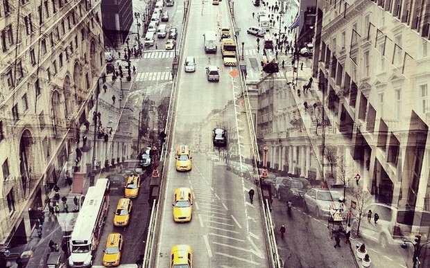
This from Daniella Zalcman combining an image of London and New York
http://www.citylab.com/design/2013/05/photographic-love-letters-new-york-and-london/5653/
https://www.flickr.com/photos/midnightquill/sets/72157632187909790/with/8643268502/
A different sort of thing to mine. But I do find these interesting
I do like the way these two images have been combined. The plane of the road in the London Image matches the New York image till you get to the centre of the picture. If you try to imagine what the NY picture is…. you might be on a balcony in a huge public building. (ok read the blurb! the NY image is of the Grand Central Terminal and the London shot is where Zalcman Lives in Pimlico). I did like it when I saw it on the images bit of google without knowing where it was anyway? The figures look Lowrie ish. Geometry lines and angles aplenty.
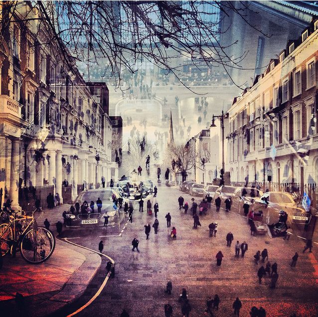
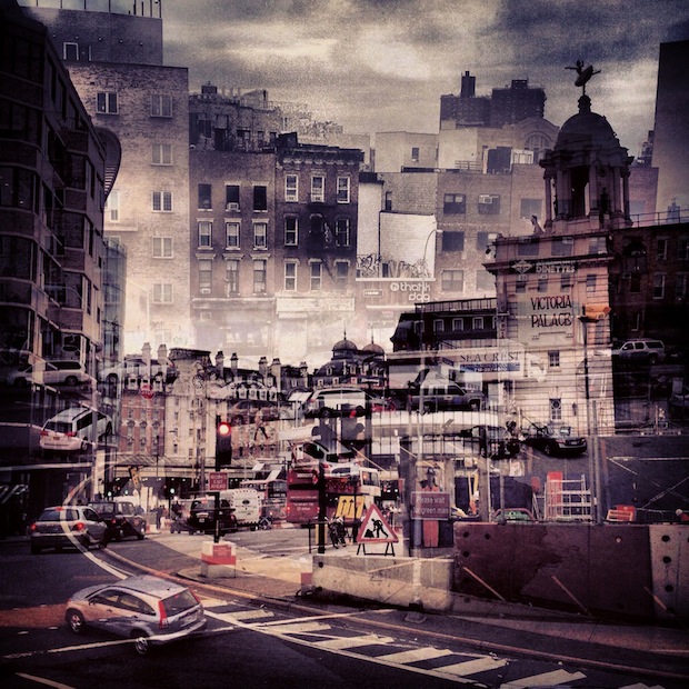
Ha! I must be getting good at this, I found this image on google and thought it must be by Zalcman.
If go to pinterest then go ” visit site” you find that it is Zalcman. This is so well constructed. The curve leads you round and back into the image.
This by Idris Khan
Oddly, or maybe not so oddly, this image was pinned by the same person who pinned the previous image by Zalcman. Khan has gone round it taking lots of images and sticking them all together in Photoshop.. It looks as though it might take of!
But go here to experience the exquisite blurb that goes with it. It’s to die for isn’t it? (Linked from pinterest).
http://www.saatchigallery.com/artists/artpages/idris_khan_becher_prison.htm
This is similar to my fountain image in that I have gone round the fountain taking shots all round it too. Not sure if Khans image is of more than one similar gasholders put together or not.
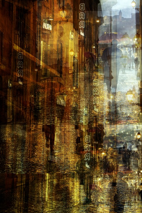
This, another take on it, from here… By Alessio Trerotoli
Urban Melodies: Multiple-Exposure Street Scenes Remix Cities
and here
http://www.alessiotrerotoli.it/galleriaURBANMELODIES.html
You can see the bar sign at least four times here… ah, it’s reversed…. a reflection in a window? This photographer takes 4 or 5 different images of the same location and adds them together. The camera has looked up and down in this image, sideways too by the look of it.
and
All food for thought…. I took some images of a restaurant we go to in Northampton The Karmana. I’ve got to know the owner and I was trying to do some images of his restaurant for him.
I’ve remembered these, as I’ve been researching the ones above.
The first two are multiple exposures done in the camera, just experiments really to see what might be done.
This one, two shots taken from different angles, is a different approach. This is a work in progress. I have to do more orthodox images first and show him one like this to see what his reaction is.
I think that the Zalcman images are stunning, the composition is spot on as is the colouring and contrast in the images. I will do something like hers in the near future.


